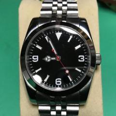
New Logo...thoughts?
-
Recently Browsing
- No registered users viewing this page.
-
Topics
-
Posts
-
I’ve been playing with a NH35 movement that which has the classic Etachron regulation system and a few balance assemblies as practice. What I’m trying to do is get comfortable with the effect both the stud and regulator pin positions have on rate and positional error. When I install a new balance assembly I install it with the assembly in place on the cock and cock is attached to base plate. I use the back of the tweezers to push the stud into place and feel the click. However, I noticed that the angle of the stud can be adjusted and what I also noticed is that some movements have the stud carrier arm bent down a little and that changes the angle of the hairspring leaving the stud. This angle effects how the spring goes through the regulator pins and also the spacing of the coils opposite the stud. What I thought I was supposed to do is set the regulator block in the middle of the curve, open the pins, and use the stud angle to center the spring. Then the stud is set. Now on all the new NH movements I have seen the angle of the regulator block is about 60 degrees counter clockwise from full open. I watched a video where the author used the regulator pin adjust to adjust rate and position error. When I close down the pins I do notice that the rate increases but also the amplitude drops, the coil spacing changes and hairspring appears slight straighter between the stud and the regulator block. If I open the pins the amplitude comes back, the spring breathes a bit more between the stud and the regulator block and the rate slows. So, a long post I know but I would really appreciate any advice on how to correctly adjust the etachron system for rate, amplitude and positional error.
-
By Neverenoughwatches · Posted
Aw come on Andy, it was just a comparison between spending 30 quid and tackling a tricky piece of work. You appeared to be volunteering, i volunteer for stuff all the time it gets me into all kinds of trouble. -
By Neverenoughwatches · Posted
It's not really shown here , but the blade flips over, so it faces the other way. The knob and threaded case holder then pushes the caseback seam into the blade. Once the blade starts to penetrate into it, the lever and blade are lifted , which should hopefully pop the back off. A lot of fashion style cases have very tight seams and need a sharp blade to start separating them. Don't buy the cheaper plastic versions of this tool, the posts with the pins through for blade holder break easily if the apply extra force to blade. -
You will still be looking for a balance complete I’m afraid, this is the balance staff, balance wheel and hairspring in one package. Hairspring and the balance wheel are matched in the factory. Whilst we can change a balance staff the hairspring and balance wheel stay together. Tom
-
The hairspring end has come adrift from the small terminal barrel. I have tried to remove the taper pin to relocate it, but the task is beyond my skill set, eyes, hands and being in my 70s, probably beyond my life expectancy. It is not too badly mangled on the end. On the ebay offer, that really is a bit on the rich side. I'll keep looking, maybe a good hairspring will turn up with a shot balance staff. As for time spent on knees. I made up one of these from 3M magnetic tape and a piece of wood. It works well for magnetic parts. Other things I have suffered with. I found lubricants so very expensive that I bought some very small syringes and tiny needles. I just decant a drop into my oiling pots when I start a movement and the remainder keeps really well in the syringes. Finally identifying the correct screw for the part led me to make up the board in the final pic. Thanks for the info. Kind regards Chris
-


Recommended Posts
Join the conversation
You can post now and register later. If you have an account, sign in now to post with your account.
Note: Your post will require moderator approval before it will be visible.